
This is just to show how it will look like when people put it inside a coin (which often happens)
1 Like
Haha I don’t have time to redo your idea in photoshop atm, but maybe someone else can 
@drvn thanks, I like your idea  May I draw it based on yours? when I got a time
@gary Yes, of course!
1 Like
@tromp @drvn here’s a 5 minute quick n dirty prototype:

My personal 2 cents (about the original version)
Pros: Really nice and creative concept, in particular chained blocks, and cut through, very much in the spirit of Grin!
Cons: Not super legible, not sure how it looks big and small, does not feel particularly iconic/memorable, and… it feels to me as though the ICOs of past have already taken the “hey let’s make a minimalist logo out of some geometric shapes”-idea and iterated on it in absurdum. I therefore fear that this style would have Grin blend in very neatly with the general population of alt-coins. This is not the fault of the logo itself, it’s rather a victim of unfortunate circumstances. 
1 Like
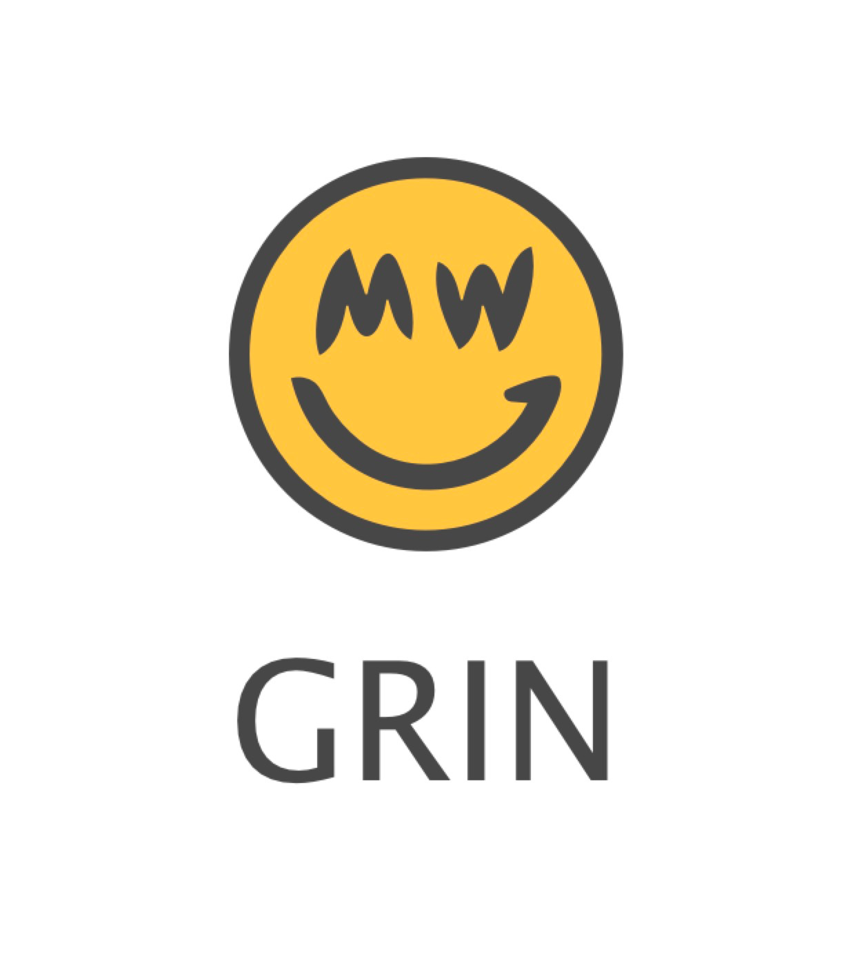
In stead of showing the cut through concept, which is almost few people can get, my idea is to show ‘M’ on left, and “W” on right, same shape but with different line color to present it, and leave ‘G’ still in the middle. No time right now to do that, but later I will try it
@lehnberg I totally agree with your cons. A logo like the one @hashmap posted is more unique and brings a message that we don’t care about the esthetics, all that matters is our deep crypto.
What about a cube with a smiley inside. And/or a cube with mutliple smileys or just one smiley on the outside surfaces… like instead of a round smiley a block-shaped smiley.

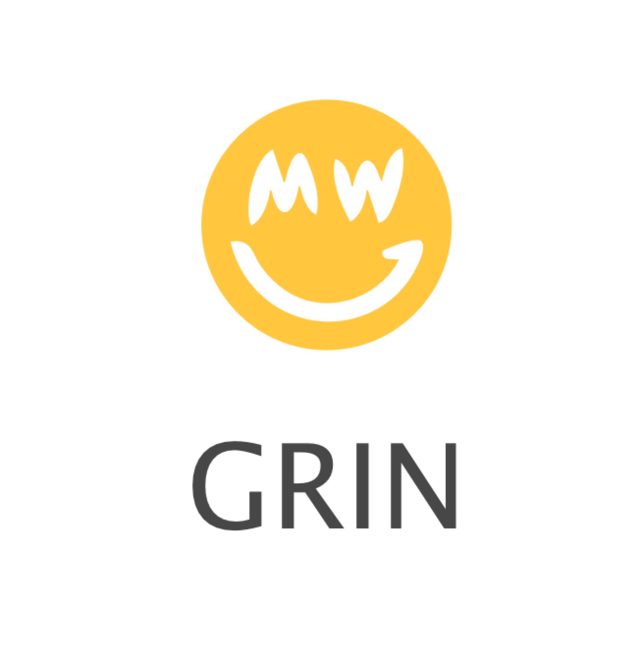
Beam uses the current logo in their comparison table, and I personally think it makes Grin look great, in particular compared to the other logos. It truly stands out from the crowd.
5 Likes

just wanted to compare… .
If I made the features a little bit thicker I think it would be just as legible at a small resolution.
question then is if people like the GRIN-smiley more (which I do) it would be spending a little more time on to get it perfect.
Not me; I prefer the simpler MW smiley.
It looks more balanced and distinctive.
beam table
… is that… voluntary security
Whats this about user supplying meta data?
Surely they are not that dumb to repeat that mistake, right?
I think the mw smiley works really well as a small icon and when in a more neutral setting.
Yet spelled out grin is just so cheeky and fun. I definitely see it being used across the community and in graphics.
1 Like
I signed up only to admit that when I first saw the MW smiley a few weeks ago I literally thought it was joke, but recently it has really started to grow on me and I like the distinctive Idea.
I feel like it was made to laugh at all the other shitcoins around, with a good and cocky spirit about it. Love it.
3 Likes
building on @0xb100d’s previous experiments and the swag he’s got on tmgox.com, here’s how the logo looks with simple Courier Bold, but with the grin letters stacked. I kinda like it. Feels playful, yet balanced, simple, and harmonic.

1 Like
@lehnberg To be honest, I don’t like the splitting of GR and IN 
![]()
![]()
![]()
1 Like
Yep, that’s okay. Nobody in the governance meeting did either, so we’re definitely not going with that option! ^^ Back to the drawing boards!
