Discovered something new as I follow the tally so far on the @grinMW poll (please vote!):
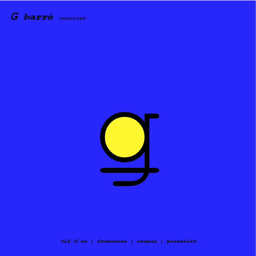
The best part is this is just your simple, antique, humble, no frills, courier font with minimal editing. I also tried comic sans but good prevails over evil …
Almost all computers in the world have this font, and of all the lowercase G’s I found, this one is the most common, being present in more fonts sets than the other crossed-through-style in the poll above. Together, this makes this design the most universal I have found. There are also explicitly FOSS versions of the font, so if we like this one we can do it again in a few minutes completely open source, but it has likely been modified enough already to be used safely. The original IBM courier font is also totally free to use, so it is probably a non-issue.
If you want to test it yourself, simply copy the [ǥ] symbol and paste it somewhere and change the font to courier/courier new. Simple, minimal and scalable!
At the bottom are some of the things the logo evokes to me (making the circle yellow is really my only original contribution). @lehnberg has cleverly pointed out that the line passing through the letter represents the cut-through that makes mimblewimble special. The snitch is something Harry Potter values, and dandelion is the new node propagation technique. I also like the fact that the yellow circle is like a face without face, anonymous, grinning invisibly …


bonus elvis version
The symbol does insinuate a… unique… pronunciation of ‘ǥrin’ however…
Some variations on the theme with shorter stroke lines, and/or with the stroke line higher up as it renders in some fonts.


I start to see a face in profile when I try the other cut-through symbol


bonus comic sans grin
