It’s nice to see the blocks overlapping in perspective, but I think the letters look better as highlighted block edges (see Grin Logos for Community Consideration) rather than inscribed on the faces…
No I’m exactly where I feel I need to be. The “slacky subversiveness” is my political beliefs watered down by the rapid growth; this is the only new coin with good tech and a cypherpunk foundation; naturally I’m here, poking and prodding.
As a tool for private and secure exchange of money or assets Grin has appeal for people of many different political, social, economic etc beliefs. I don’t believe this forum was intended to be hijacked as a platform for pushing some anarcho-capitalism ideology. The internets have plenty of other forums for that.
1 Like
As a digital currency, in the bitcoin era, getting rich is in the interest to everyone. That’s exactly the rapid growth I was talking about.
If you cared enough to go through my old comments to find out I’m an ancap why didn’t you just go crtl f thru the cyphernomicon? I’m “hyjacking” nothing
The tech without context is what lead to the shitcoin bubble, forgive me for wanting to minimize harm
The blocks are shown only as a reference for the origins of the design, they would not feature in the final logo. Having a logo that relies on complex imagery combined with the name would be problematic I believe. My solution delivers the original ideals of the blocks, but doesn’t obscure the final result. Colour would need to be introduced as well. But this is just a first draft, not even sure if this thread is still alive or not?
Hey,
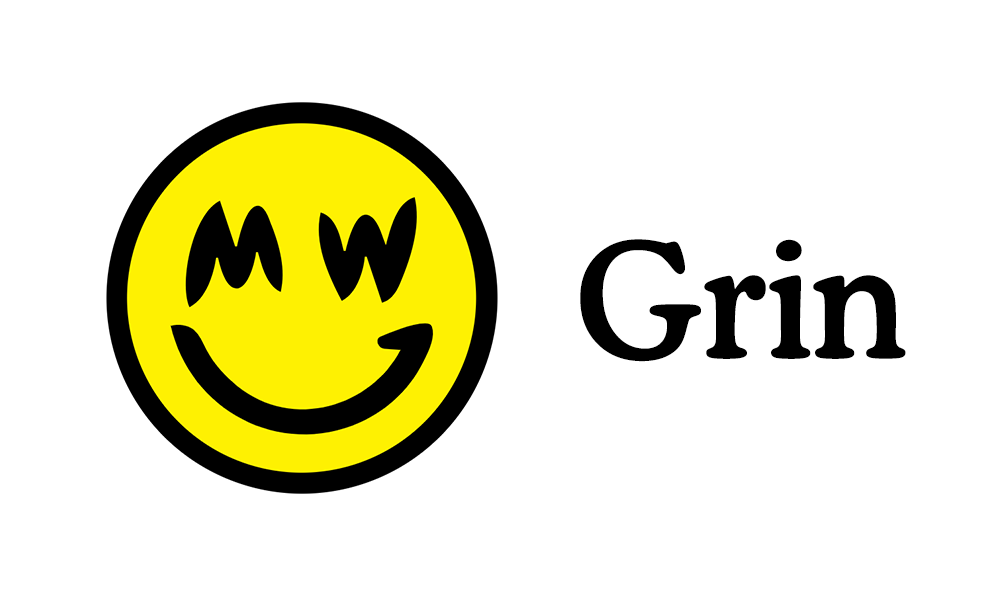
Made some fixes to @0xb100d’s original logo.
I made the smile smaller to lessen the focus on it, and moved the eyes around a bit, to make the face more balanced. The smile also connects more nicely with the left eye “M” now, but did want want to make it a perfect connecting arc so that it still looks like a face.
For the text, I picked CooperBT. From reading Grin’s mission, I get the sense that it’s something among the lines of “Private coin for everyone.”, so it has to be “inclusive” enough. A monospaced font is cool to developes and all, but not so much for non-developers or non-tech people. Sans-serifs does not mesh well with the “M” and “W” either, so had to be serif.
.svg: https://gist.github.com/nijynot/5fc37675abbd53171a41a9f22ae1c710
Font: CooperBT in regular or bold, with tracking 15 on “r” and -13 on “i”.
Before is left, after is right.


5 Likes
Tks for sharing…good work on the smiley face …the ‘after’ does look more balanced imo.
That Cooper font def. sits quite well with the smiley but is it a bit bland/whatever? Are there any alternatives you could suggest? Something a little more original/distinctive?
1 Like
Thank you! Was hoping someone would tune the ratios a bit, this is more handsome. Will need to be updated in a couple of places I will tackle a couple.
what do you think of the ratios on the grinception logo? here: Grin Logos for Community Consideration
Am I the only one that prefers the “less balanced” version? 
1 Like
No, you’re not alone.
I think the new one, while better balanced, looks a little childish.
I think the optimum might be somewhere in between the two,
but currently, between these two, I slightly prefer the original.
2 Likes
Hey everyone,
I think the logo should be more readable in smaller formats.
Most of the time it will be seen in sth. like 15x15px - 50x50px.
Those artistic strokes will blur away and not be recognized.
It would also be hard to do variations of the logo or work with it.
You would have to mimic the style of the stroke.

2 Likes
I’m still not clear whether Grin is looking for logo ideas or not? I would like to give it a shot if it’s not too late.
1 Like
Grin is dynamic; every design is as official as the next.
Can you not do that? Your selling yourself short.
Meritocracic organic systems do not have declared by fiat icongraphicy, but that’s not the same as not having it. 80/20 laws are a thing, your logo won, you run the shop and are making a book. Can I suggest embracing the pr role to smooth the hard road ahead.
You earned the untitled postion, ask for the help if you need but don’t do this timid thing
And don’t delete your posts after I compliment you, I do that about once a week, and while I am an asshole, if you remove evidence of when I think highly of one person in 1000, poeple may think I’m straight up megalomaniac
1 Like
@0xb100d I think the ratios are alright, maybe would’ve fixed the same parts as I did with previous one. I do prefer the MW logo though as it’s more simple.
@lehnberg @tromp The less balanced logo does have it’s own charm for sure. Although, Grin appears to be more of a minimalist approach to the privacy coin, so I think the logo should strive for the most simple rendition as possible.
The balanced one also looks more like an emoji, which is also maybe why it seems more childish. Do we want it to look more like an emoji or childish though? Well, emojis are nowadays widely used, and most have a familiar relation with them.The familiarity matters a lot imo.
I like the thinking that: for every “new visual”, add a “familiar visual” to it. This way, it’s becomes easier accepted by the mainstream, because it contains something they’re already familiar with. The “new visuals” are the MW eyes and the quirky grin, and the familiar visual is the ratio of an emoji.
1 Like
I think you nailed it:
That’s why I personally prefer the old (less balanced) one: it’s more of a logo, less of an emoji.
1 Like
really love it…but i would go for more a Harry potter or matrix green color


You’re on fire with all these different assets right now. Thanks. Tools for the toolbox!
1 Like
Which software are you using to make them?